Photography
Project Snapshot
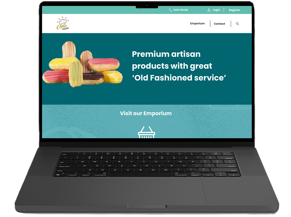
Ora Foods had an online ordering portal, but customers didn’t trust it. They second-guessed their online orders, missed key features, and frequently defaulted to phone calls.
As Head of UX/UI, I pushed beyond the tech brief, ran customer interviews, and uncovered the real friction: a lack of clarity and reassurance at every step.
I simplified the browsing experience, redesigned the visuals, surfaced powerful tools like templates, and rebuilt the order flow.
Online adoption rose by 10%, admin hours dropped, and the platform was finally reliable, intuitive, and worthy of adoption.
Read more

Situation
Darryl approached our team with several “website upgrades” that he believed would help expand the business and improve customer satisfaction. In UX terms, these upgrades translated into two core problems.

Task
As much as we trust our clients, it would be naive to assume these problems were truly at the centre of customer frustration, or that solving them would magically improve operations overnight.
So as lead on the project, I pushed for proper UX research before jumping into design. Darryl agreed to expand the scope and gave us access to his customer base so we could validate the assumptions.
Testing the Assumption
The first attempt was a pop-up survey on the order page. Two weeks in, it produced only two responses. With incentives off the table, I pivoted to cold-calling the most active customers.
The calls were run as empathy interviews where I let users lead the conversation and asked open-ended questions about their ordering habits.
The feedback was incredibly revealing.

Internal Staff Workshop Research
I visited the warehouse and ran workshops with staff who spoke with customers daily. Their insights confirmed the customer pain points
“Sometimes the page took so long to load that customers gave up and ordered over the phone.”
“Some customers were clicking ‘place order’ repeatedly because they weren’t sure it had worked. I usually had to call them to confirm they only wanted one order and often refund the other duplicates.”
With this feedback I was able to reassess the original brief
Insights
Problem 1 - Confirmed

Problem 2 - Modified


Action
Users
From the research we identified three main types of customers:
-
Customers who placed most orders through the website
-
Customers who preferred ordering by phone
-
Customers who used their own CRM system to email order forms
Given the scope and budget, we focused on improving the experience for existing online users first.
Converting the other two groups would be a larger project on its own.


Result
Conclusion
As a lot of exploration and research had pushed the project timeline out, large-scale testing wasn’t possible before launch.
Lessons learned:
-
Large end-to-end design projects make it difficult to measure incremental improvements.
-
Updating both the visual brand and the e-commerce experience simultaneously makes staged rollouts challenging. Running old and new aesthetics side by side would likely confuse users.
-
Always trust my gut when it comes to research!
What I would do next time in the same situation:
-
Break the project into sprints to slowly implement and test each phase. (e.g. introducing the template ordering flow before redesigning the shop interface)
-
Consider refreshing the visual brand first, then layering in functional changes.
-
Run A/B tests on product card designs and analyse behaviour using tools like Hotjar.
Overall, Darryl was very happy with the outcome, and the project provided valuable lessons in research, design systems, and UX strategy.
Problem 1: Portal redesign

User Research Methods for Problem 1
Alongside empathy interviews, I conducted competitor analysis and desktop research. Interestingly, many food suppliers had the same issues: dated websites with clunky interfaces.

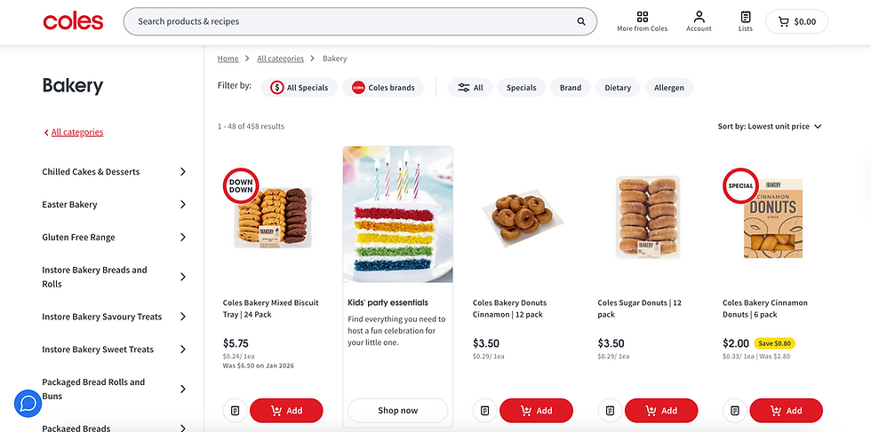
Instead of limiting inspiration to direct competitors, I expanded research to adjacent industries: grocery delivery services, meal kits and large online supermarkets such as Coles. These businesses were helpful references because:
• Their branding is modern and polished
• Their Ui (food item product cards) and functionality (quantity, favourite, add to cart) are highly refined
• Their UX patterns are familiar to users and used frequently by millions of users.
Rather than reinventing the wheel, it made sense to learn from companies that spend millions on design and marketing. It would have been remiss not to take guidance from companies that already do it right.

Insights & Solutions for Problem 1
1. COLOUR PALETTE TO BE REINVIGORATED
Competitors used bold colours with white space for a clean interface. Darryl wanted a “coastal feel.” This new palette differed significantly from their existing branding, but with no budget or time for a full-scale rebrand, I adjusted the colours to meet accessibility standards and created flexible shade stacks with feedback colours that could be applied consistently across the site.

Client palette inspo

Shade stacks
2. ICONS TO SIMPLIFY UI
Many users were busy hospitality staff with limited experience navigating digital systems.
I introduced familiar iconography from Google’s Material Symbols, adapting icons to ensure consistent stroke weight and style, to make interactions intuitive and reduce friction.


3. BROWSING AND FILTERING
Products were originally browsed via brand tags. Customers had to click a tag just to see a product, and it being pulled from CRM meant duplicates (e.g., La Rose Noir vs La Rose Petit Four) and unnecessary visual clutter.
I redesigned the filters to be more structured and intuitive, letting users narrow products by:
-
Brand
-
Food category
-
Dietary requirements
I also added sorting options for:
-
Price
-
Popularity
-
Name
This made product discovery faster, clearer, and reduced cognitive load, creating a smoother, more efficient ordering experience.


Wireframing filter lists and basic shopping cart layout
Reception and changes
The refreshed palette and icons were approved quickly and had met expectations. Darryl requested a few more motifs and textures to bring in a casual, food-inspired feel and we added some playful flour-like textures that were used at a low opacity in footers and headers. Custom icons were also requested for allergens and dietary info to use on product cards. This meant additional work on iconography.
Challenges
Several complexities arose while redesigning the product filters:
-
Balancing flexibility with simplicity: We wanted users to be able to filter and sort products extensively (by brand, food category, dietary requirements, price, popularity, and name) without overwhelming them with too many options at once.
-
Syncing data between WordPress and the Ora Foods CRM: A master Excel spreadsheet was created to map all product information—classification, brand, ingredients, dietary info—so it was consistent in both systems.
-
Handling back-end limitations: Some data couldn’t transfer automatically between WordPress and the CRM. We needed to decide whether new products and stock updates should be entered manually or pulled via an API, and which system would be the source of truth for live inventory.
Resolving these issues required ongoing collaboration between development, design, and the Ora Foods team to ensure that the new filters were not only functional but also reliable and scalable across the business.
Problem 2

Insights and Initial Solutions
Although the portal redesign addressed Ui and UX, adoption of the template feature was still poor. To solve this problem, I asked myself:
-
How can templates become the natural starting point?
-
How can we reduce the learning curve from their current manual processes?
-
How can we guide users without overwhelming them?
This saw the entire customer order journey center around the templates.

The solution: a step-by-step order flow with minimal decisions per screen, centering the experience around templates. Giving the user minimal options per screen made it 'fool proof’


Reception, changes and Challenges

Directing users to the template system was one thing, but teaching them how to use it was another. With some testing performed by the clients' team on the staging site, I designed and implemented:
-
An onboarding wizard for first-time users
-
Contextual tooltips on hover to explain features
This increased clarity while keeping the experience light and intuitive.

Tool tips were activated on hover

